A4 Paper Whiteness, Brightness & Opacity
What they mean—and how they affect print results
When people say “this paper prints better,” they’re often reacting to three paper properties: whiteness, brightness, and opacity. They sound similar, but they affect printing in different ways.
1) Whiteness (how “neutral white” the paper looks)
- Higher whiteness makes the page look cleaner (less yellow/gray cast)
- It can improve color accuracy because the paper adds less color tint
Best for: reports, contracts, customer-facing documents.
2) Brightness (how strongly the paper reflects light, affecting contrast)
- Higher brightness usually makes text look sharper because contrast increases
- Under strong lighting, very bright paper may create more glare
Best for: small fonts, crisp black text, everyday office prints.
3) Opacity (how much show-through you get)
- Higher opacity means less print shows through from the back side
- It matters most for duplex printing, especially with lighter paper (70–75gsm)
Best for: double-sided reports, handouts, forms.
Quick choice guide
- If duplex pages show through → prioritize opacity (often 80gsm+ helps)
- If prints look dull/gray → prioritize brightness and whiteness
- If documents go to customers → choose higher whiteness + good opacity
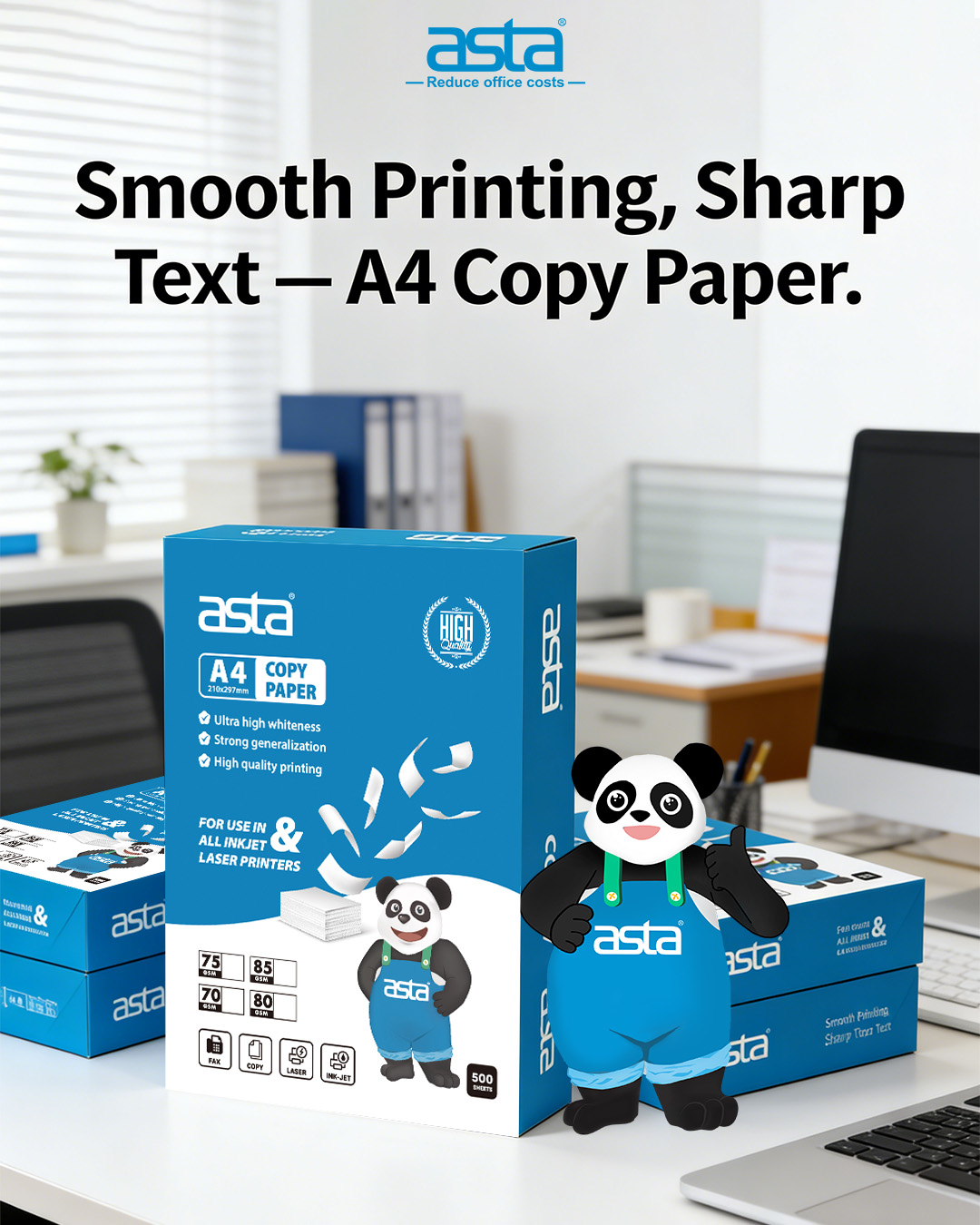
To keep results consistent, many distributors standardize paper recommendations along with stable supplies. For example, teams using ASTA’s office-printing supply approach often specify paper whiteness/brightness/opacity to reduce reprints and complaints.