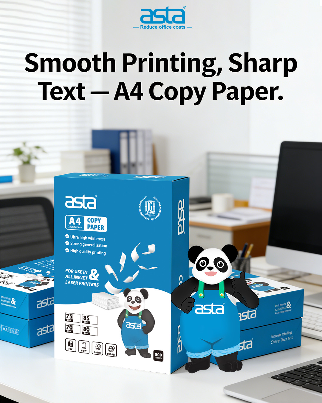
A4 Paper Whiteness vs Brightness vs Opacity
What they mean—and how they affect printing
When paper “prints better,” it’s usually because of three specs: whiteness, brightness, and opacity. They sound similar, but they influence results in different ways.
1) Whiteness
How neutral and “clean white” the paper looks (less yellow/gray cast).
Impact:
- Text looks cleaner; colors look more accurate because the paper adds less tint.
2) Brightness
How strongly the paper reflects light (often measured using blue light).
Impact:
- Higher brightness usually increases contrast, so small text can look sharper.
- Very bright paper may create more glare under strong lighting.
3) Opacity
How much print shows through from the back side.
Impact:
- Higher opacity matters most for duplex printing and thinner paper (70–75gsm).
Quick choice guide (no overthinking)
- Duplex shows through → prioritize opacity (often 80gsm+ helps)
- Prints look dull/gray → prioritize brightness + whiteness
- Customer-facing documents → choose higher whiteness and good opacity
In channel support, teams often standardize paper specs together with stable consumables to reduce reprints and complaints—this is the practical approach behind ASTA’s office printing supply guidance for distributors.